
i assembled a "print-ready" version in issuu, which is why the document doesn't bleed (awesome crop marks) or have the proper gutter.
Monday, October 29, 2012
skype's—for its language and attitude.
i assembled a "print-ready" version in issuu, which is why the document doesn't bleed (awesome crop marks) or have the proper gutter.
Friday, October 26, 2012
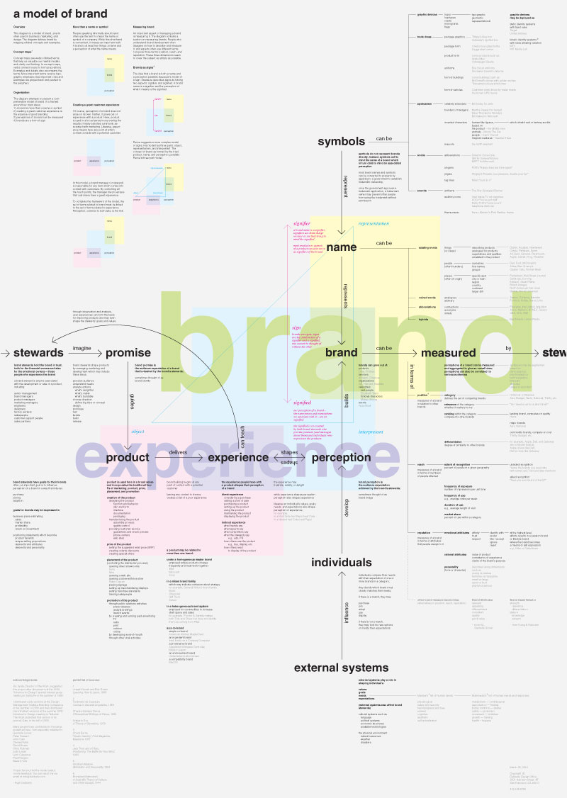
ian spaeth's rebrand book
be aware that ian later removed the page numbers and fixed some alignment issues before sending off to blurb.
Wednesday, October 24, 2012

[alonso] Focus
Moving forward I plan on devoting my focus to a film piece; a short film if you will. I imagine this living on things like the website, social media, vimeo, youtube, etc. Basically any avenue that could be used as "advertising." Through out the process I have been talking about the experience. The environment. The lifestyle. For me These are things that are hard to embody solely through typography and color. What does the brand look like in a time based medium? That is what I am asking myself. I feel as though I can capture the qualitative aspects of the Hamilton's (sophistication, confidence, unreserved) through such an exploration I hope that this video will not only be an asset to my brand, but will also define the demographic that I've had trouble articulating and give life to the experiential part of my barbershop.
[lil s] focus
Because it plays such a big role in the representation of North Stars, my focus will be the club website. All of the club's audiences view their site and look at it as a way to learn about the club, understand scheduling, and compare to other clubs. I want to make it so information on the site is easier to access/ find/ navigate to. I also want to make it more eye-pleasing, not only so it sticks out from other clubs, but so visiters can view going online as enjoyable, rather than a boring task to obtain information.
[downing] focus
after thinking for a long time about this, i sat and questioned what would be good for the lake? I decided on doing a sound motion narrative introducing the lake, showcasing it, and showing people what its about. If time allows i would also like to create some directional signage for the lake because there really isn't anything currently to let you know where you are at.
Tuesday, October 23, 2012
[collin R] focus
While this wasn't explicitly offered as a direction, I heard the Mr. Kidwell offhandedly mention it during critique, and it stuck like glue… I'd like to do a calendar. Like a garage calendar complete with retro calendar girls. Intro spread, 12 months, exit spread, front/back cover. I'd like to actually produce it, but I need to do some research…
[carr] focus
so, as i move forward with my boulevard rebrand, i'm planning on doing some packaging to complete the system. i'm hoping to do at least two sets of packaging, in keeping with boulevard's tradition of branding each of its individual beers separately. i'd also like to create a separate packaging scheme for the smokestack series beers—either a 4-pack or one of the larger bottles.
here's some inspiration i've compiled so far.
Sunday, October 21, 2012
[rojas] focus
Because I have chosen a museum I felt it best to focus on a brochure that will capture the essence of the museum and entice patrons for a visit into the world of toys and minis. I will also tackle creating interior graphics and signage. What I am most excited about is creating a series of posters that advertise the wonders of the museum. These posters will serve as a way to excite and provide a bit of humor.

Friday, October 19, 2012
[jessie] focus element
My focus is going to be on packaging and vehicle graphics. I think there's an opportunity to design the touch points as a story...after this hypothetical Ted character goes to the website (in this scenario) it leads him to the truck and every touch point in between that...from the toothpick in his sandwich to the truck itself; I think it's important to have those key details shown. If time didn't work against me all the time, I'd try to do something with motion. I would like to show a fun animation of the brand "doodles" on the website or even projected onto the truck at night?
[armstrong] focus
Moving forward I will be focussing on the direction of Sector3. I will be creating a sound and motion narrative (commercial) that will showcase both product and company value. This should also showcase the different characterizations of the bass player that the company strives to provide for.
[ashl E] focus
i've decided to focus on a sound & motion piece for my music therapy brand. this will give me an opportunity to capture the music and the passion presented while patients are involved with music in various ways. this could be a hypothetical commercial or an opener for a bigger project that gives a good summary and feel of what this music therapy center is all about.
[eli] focus
I will be focusing on Solutions or (Google's) web presence across a diverse series of representations of pages created for the primary target audience. I will be applying the identity to iPad, iPhone, and Laptop.
[jumper] focus
Since I am branding a restaurant I find it pertinent to focus on the menu. I will be bringing in the quirkiness of the brand into the formal qualities of the menu. Learning that the menu had to be twelve pages I will be adding a lengthy drinks section as well as dessert section.
[erika] focus
I will be focusing on Cogneedo's website and social profiles (like Twitter and Facebook), with emphasis on the website, of course. It just makes sense for a tech-based startup to have a good web presence. I'm excited to take on the challenge of designing a whole human-centered web experience. If time allows, I'll even make it all functional.
[jwilson] focus element
it's my intention to use my focused-piece time to work on updating the recordbar menu. so far with my identity, i feel like i've spent a lot of time with "great tunes" and it's about time i paid some good attention to "great taste." if time were to permit, i would love to get a quick motion piece out of there, as well, but i think the menu is more important to tackle.
[sam] focus element
My focus will be on the more tactile experiences of the brand such as packaging, and interior graphics. Fizz Bomb is primarily a sit down experience, but also carries a variety of products such as bottled soda and candies to extend the brand beyond it's main physical location. There's opportunity to create a cohesive location-based designed experience, which the competitors fail to do.
If time allows, I'd like to also create a motion piece that would exist within the space to further visualize the explosive nature of soda in time based experience.
If time allows, I'd like to also create a motion piece that would exist within the space to further visualize the explosive nature of soda in time based experience.
Thursday, October 18, 2012
[keaton] focus
my focus will be on creating an environmental/atmospheric sound and motion based graphic that would be looped in the shop conveying seasonal rhythms. with this channel for the brand, i'd like to explore some logo-builds and possibly a sound-mark. i see potential for having an informative narrative told with sound and motion (our essence, mission statement and attributes) in some spaces, as well as a non-informative, more environmental/decorative (the visual way the attributes and values are represented) narrative to carry out brand identity.
[mmarston] focus element
I want to create packaging. Versions of different tea that CUPPA would
offer. Either a jar, tin, box system that would available for purchase. I
also want to have a jar/tin for purchase for people to bring back in
with them to buy the tea. First and foremost CUPPA is a tea house, but
patrons have the tea that they drink available for purchase. Most tea
stores use tins for loose leaf tea so that they can reuse it when they
need to refill their tea.
[matthew] focus element
For my focused area I am going to generate a dimensional packaging series. I want to carry out my system and its objective by displaying how my product is housed. My attributes speak to the personal and credible experience that each patron concludes from their meat selection process. The packaging will act as the visual representation for these attributes that will live on past the initial point of the purchase. Once the packaging is removed from its original environment, it will be able to reiterate and extend the meat markets system and goals. The quality will live in the product itself but it will be visually carried out to all who interact with the product and its packaging. If time allows, I would also like to touch on a simple and quick poster series that will also act as an extension of my system and how lives on a larger scale beyond the establishment itself.
Monday, October 15, 2012

Sunday, October 14, 2012

Saturday, October 13, 2012
Friday, October 12, 2012
Wednesday, October 10, 2012
[carr] phase 2
so, to say this project has been a huge challenge is an understatement. i approached this project knowing that rebranding boulevard would be hard, but i wanted that challenge.
i wanted to get back to the roots of what having a beer means—it's an experience. i think that all too often, consuming beer turns into a commercial activity rather than an excuse to get together with friends and enjoy good company and good conversation. with these identities, i tried to get back to that notion, while communicating how beloved boulevard beer is within greater kansas city.


Boulevard p2
[lil shank] phase 2
NorthStarsVBCbrand_02
When it comes to volleyball clubs (local ones in particular), quality is displayed through skill. North Stars has mastered showcasing themselves through that channel. The issue is, what they have to visually represent themselves doesn't clearly announce that this group has talent. North Stars' competitors have the same problem, so to rebrand them is not to necessarily out-do anyone (because that would be too easy). My goal is to develop North Stars' branding so their visual identity matches their skill level. My objective is to call out how they successfully work as a team. This club is one big family that understands that in order to win, you must have fun. At the same time, as board member and 18‘s national coach Laura Tomney puts it, "We know when it's time to stop goofing off; we mean business."
When it comes to volleyball clubs (local ones in particular), quality is displayed through skill. North Stars has mastered showcasing themselves through that channel. The issue is, what they have to visually represent themselves doesn't clearly announce that this group has talent. North Stars' competitors have the same problem, so to rebrand them is not to necessarily out-do anyone (because that would be too easy). My goal is to develop North Stars' branding so their visual identity matches their skill level. My objective is to call out how they successfully work as a team. This club is one big family that understands that in order to win, you must have fun. At the same time, as board member and 18‘s national coach Laura Tomney puts it, "We know when it's time to stop goofing off; we mean business."
[Erica Downing] phase 2
For my concept, i decided to stay with the original Lake name because I felt like it embodied some of the attributes currently. The lake name means sparkling waters which i feel like attributes to the word lively. With the three directions I tried to best embody as many attributes as possible while also keeping in mine with vision and essence i had perviously set.
In all cases instead of picking a new tag line i felt that the words "leave your worries at the shore" best spoke to what the lake was really about. Each direction I went with where pretty different from the others. My recommendation is to go with the final direction. I feel that this best embodies the attributes, vision, essence, and the objective.


[collin] phase 2
the experience of branding forty woods thus has been more than just imposing a designer's aesthetic on a company. it's truly been a labor of preservation, tongue-in-cheek celebration…even if the subject matter's own taste levels sometimes breach the culturally accepted.
uncouth: celebrating the low-brow, the tasteless, fart jokes, skin magazines, beer coozies, styrofoam spitters, big ass trucks and big ass women.
unrefined: this ain't switzerland.
unapologetic: we are who we are, and we're proud of it. maybe we're a little rough around the edges, but maybe you should get off your high horse and play in the dirt sometimes.
collin rausch phase 2 final
[mckenzie] phase2
mmarston_phase2


For my tea house concept I decided to use the name CUPPA, but still include the handwritten elements. I really tried to focus on merging certain idea together. After the last critique it seemed that there were elements from all of them that seemed to work. The name CUPPA resignation best with my idea and that this whole idea came from a British idea. Through my attributes I want to get across that CUPPA is a place for anyone. Even if a person is a tea lover, they can still go to CUPPA with friends and family and enjoy themselves. It is based on the experience that they are getting and the atmosphere and products they are seeing when they go the tea house.
For the design I wanted to do something that is very simple, graphic, and has a feeling of sophistication. The black and gold give a feeling of confidence that a person would probably not associate with tea. Of course there are many more elements to design and create, but I started with some of the first things a person would see or pay attention to, the store front and probably the menu whether that be from online or when they are greeted inside.
[jessie] phase 2
This hypothetical food truck company is one about the feeling of joy. It's about remembering those childhood days of eating and playing and being at your happiest. It seems like these feelings are often forgotten as an adult. My objective then is to develop a brand for a mobile restaurant (food truck) dedicated to bringing joy and empowering communities through food. In essence, it’s “running on joy”.
In order to do this, I've developed 3 distinct directions for the identity of the brand based upon the three attributes that define the brand: empowering, nostalgic, and playful. Each attribute visually speaks to a specific part of the brand and provides the voice that characterizes the brand's overall essence. “Empowering” addresses the environmentally concerned aspect of the brand; “nostalgic” addresses the familiar homey aspect of the brand; while “playful” addresses the fun aspect of the brand. Whether it’s a community, a neighborhood, or a family running on joy, it’s about inspiring joy in everyone.


 Phase 2 Final
In order to do this, I've developed 3 distinct directions for the identity of the brand based upon the three attributes that define the brand: empowering, nostalgic, and playful. Each attribute visually speaks to a specific part of the brand and provides the voice that characterizes the brand's overall essence. “Empowering” addresses the environmentally concerned aspect of the brand; “nostalgic” addresses the familiar homey aspect of the brand; while “playful” addresses the fun aspect of the brand. Whether it’s a community, a neighborhood, or a family running on joy, it’s about inspiring joy in everyone.


[jessi w] phase 2
recordbar proposal final
the recordbar's doing just fine. they've got their music scene, with local and traveling bands, they've got their gourmet meals and snacks, their bloody marys and anything else you can drink, and they've even got music trivia nights. the one thing they don't have is a way to broadcast their personality out into the world through their identity. through trying to exemplify the attributes of quality, taste, rock&roll, character, and authenticity, i hope that one of my solutions can help them get closer to matching up the experience of being inside with the view from the street and the strip-mall.


the recordbar's doing just fine. they've got their music scene, with local and traveling bands, they've got their gourmet meals and snacks, their bloody marys and anything else you can drink, and they've even got music trivia nights. the one thing they don't have is a way to broadcast their personality out into the world through their identity. through trying to exemplify the attributes of quality, taste, rock&roll, character, and authenticity, i hope that one of my solutions can help them get closer to matching up the experience of being inside with the view from the street and the strip-mall.


[ashley] phase 2
music therapy - phase 2 presentation
music has an effect on us that is unlike anything else. it's something we all have felt, but is still so hard to describe accurately with words. that's why i've decided to brand a music therapy center to capture this effect in a way that could potentially help others. my objective is to aim specifically at helping troubled youth through music, by branding a younger generation music therapy center with a laid back environment. i also want this to be a reliable brand that health professionals and therapists can recommend with confidence.
when taking three different directions on this, breaking it down to one attribute direction helped a ton. i ended up with three completely different directions to choose from in the end. i really enjoyed trying to think of metaphoric solutions and world plays to represent this brand.
[sam] phase 2
The essence of my brand is about being receptive to experience. Yet, before we can truly taste these flavors, we need four key ingredients: energy, sophistication, creativity, and fun. These ingredients make up the qualities of soda and are the heart of the brand. My goal is to attract a younger more diverse audience by visually embodying the qualities of soda and creating a medium that will foster community, creativity, and joy.
Fizz Bomb is an explosion of the flavors and excitement you feel when you experience soda. Located in the Crossroads of Kansas City, Fizz Bomb is open to serving those looking for a unique experience who live, work, or visit the neighborhood.


[sam] phase 2
[ivan] Phase 2 final
Hamilton's Barbershop Co. Phase 2
Men knew their barber and their
barber knew them. It was a gentleman's place. In each approach I focused on one attribute mainly and let the rest follow. The first direction maintains a level of sophistication in its aesthetic while exploring what a barbershop would look like if it respected the analytical, and science behind the tools and methods of barbering. The second focuses on history and tradition. It should be noted that although the brand looks to the past for inspiration, it maintains a level of here and now to straddle the fine line of "vintage" but not cliche. Lastly in the third, I tried to build a narrative around the signature and take a look at the personable attribute. Ham's would be a place coming from a strong line of barbers. With minimal approaches, the brand can become something vibrant by mixing the traditional color pallet, clean typography, and lifestyle photography.
I recommend the third direction for many reasons, but that isn't to say i do not support the first and second strongly either.
I recommend the third direction for many reasons, but that isn't to say i do not support the first and second strongly either.
[eli] phase 2
For many years now Google has benefited greatly from remaining as a familiar go to. When you need to look for something you "google it." Google's largest target audience is looking for new and more eye catching experiences that some of Google's competitors are providing.
My objective is to return Google to its innovative, diverse, and personal spirit is through a modern refresh of the over all core graphic and typeface. But also a dynamically branded Google mark for employees and Google HQ's around the world. This has been accomplished with a system that takes into account each employee or offices name, age, location, and department in which it operates. With that information I can create a mark that is not only distinctly Google but unique and reflects the core of what Google is and can bring into each one of our lives.
Google Phase 2 Final Brumbaugh
[erika] phase 2
Cogneedo Directions
The name Cogneedo means a few different things. "Cog" refers to machinery and moving parts, but it also refers to cognition and intelligence. "Need" is what the users have. And "Cogneedo" as a whole means the opposite of incognito, and refers to transparency and honesty (as opposed to the deceitful masquerading that comes with being incognito).
Cogneedo lives by the philosophy that technology should be transparent but powerful. The main concern is the users' needs and their relationship to technology in their lives. Cogneedo's branding reflects this philosophy by breaking it down into attributes like dynamic, supplementary (as in enriching daily life with additional information), and exposing the middle ground where technology and real life merge.
[michael] Phase 2
300 Pounds of Joy Branding
The branding for 300 Pounds of Joy is based off of the attributes, which are eclectically nostalgic, quirky, and a mash-up collage of world cultures. This is shown in humorous imagery, mix and match typography, and language with an attitude with occasional innuendos.
The name 300 Pounds of Joy comes from the Howlin’ Wolf song of the same name. My restaurant is a place to enjoy not only good food, but also acts as a socialization hotspot to enjoy some company. So come relish in some good stuff for your mouth hole.
Tuesday, October 9, 2012

Saturday, October 6, 2012

Thursday, October 4, 2012
from the archives
Babb P2 _dsgn405
luke babb's phase2 presentation. among other things done well, luke did a great job re-introducing the project, naming, and comparable context.
luke babb's phase2 presentation. among other things done well, luke did a great job re-introducing the project, naming, and comparable context.
Wednesday, October 3, 2012
Tuesday, October 2, 2012

Subscribe to:
Posts (Atom)
